
Visitors should be able to identify what the business does, who it serves and what happens after they make contact.
Keep the service promise specific
Visitors should be able to identify what the business does, who it serves and what happens after they make contact. Use evidence and clear explanations to support that promise. Review the homepage and a representative detail page together: each should have a role without repeating the same sales introduction. Test the enquiry path before considering the design finished.
Overview
Creating an online presence for your business through a website can be a daunting and intricate task. It’s not just about having a website; it’s about making it a place where people want to visit, explore, and ultimately convert into customers. The key to achieving this lies in the design of your website, which is where the expertise of a reputable web design company Toronto comes into play.There is no magic formula for creating a successful website, but there are some tried-and-true strategies that can help you get started on the right track. Here are some tips to keep in mind when working with a web design team:
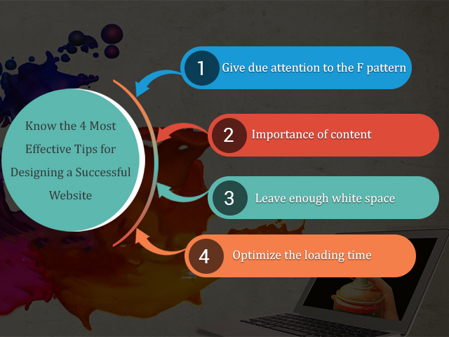
Follow the F pattern.
Studies have shown that people’s eyes tend to follow an F-shaped pattern when scanning a page. This means that the upper left corner of each page is the most visible, making it the perfect spot for your most important information.
Prioritize content.
Content is still king, and it’s essential to make sure that your website’s design doesn’t overshadow the content. Visitors are more likely to engage with a website that has fresh, relevant, and informative content.
Keep it clean and minimalistic.
While content is important, it’s equally important to ensure that your website is visually appealing. Avoid cluttering your website with too much text, images, or videos, and instead aim for a clean and minimalistic design that’s easy on the eyes.
Optimize loading time.
Internet users have notoriously short attention spans, and if your website takes too long to load, they’re likely to move on to the next one. Make sure your website is optimized for loading time to keep visitors engaged.
By keeping these strategies in mind, you can work with your web design team to create a website that not only looks great but also drives traffic and converts visitors into customers.
Turn the business goal into a clear website brief
Start by naming the action a useful visitor should complete. A service company might need an accurate quotation request, while a training provider needs people to find the correct course and understand its prerequisites. These are different journeys even if both organizations ask for a modern website. Write down the audience, the questions that delay their decision and the information the team needs to respond. This short brief is more useful than choosing a visual style before the problem is understood.
Build the sitemap around those decisions. Separate services when they have different buyers, deliverables or buying questions. Keep closely related information together when splitting it would force readers to jump between thin pages. Agree who supplies photography, approves copy and owns each integration. A project schedule should include these dependencies, because a finished layout cannot compensate for missing product information or an unanswered policy question.
A practical acceptance checklist makes the brief testable. Ask whether a first-time mobile visitor can identify the service, confirm that it is relevant, find supporting evidence and complete the next step. Check the enquiry from submission through to the person responsible for replying. Record anything that requires training or ongoing maintenance before approving launch.
Connect page content to a working enquiry journey
The most useful call to action depends on how ready the reader is. Someone comparing service options may need a scope guide before requesting a proposal. Someone arriving from an urgent search needs the telephone number, availability information and a short enquiry form immediately. Give the page a clear primary action while keeping helpful alternatives visible. Repeating a button cannot replace explaining the offer, its limitations and what happens after contact.
Ask only for information that helps the first response. Name, email, service and a concise project description are often sufficient; additional requirements should have a clear purpose. Labels must stay visible after typing, validation should explain the problem and failed submissions should preserve the visitor's work. A form should report success only after the receiving service accepts the request. Opening a messaging application is a different action and should be labelled accordingly.
Test the complete delivery path using a clearly identified test enquiry. Confirm the destination inbox, reply-to address, spam handling and responsibility for follow-up. Then define a successful lead with the sales team. Counting every button click as a lead overstates performance and hides delivery failures. Review rejected and duplicate enquiries separately from qualified opportunities, and use that feedback to refine the questions and page copy.
Use images and visual hierarchy to explain the offer
Choose visuals that answer a question: what a finished project looks like, how a process works, which product variant is being sold or what customers should expect. Original project screenshots and appropriate photographs often provide more useful evidence than interchangeable stock images. Keep the subject relevant to the surrounding section and write a caption when its purpose would otherwise be unclear. Avoid treating a generic office photograph as proof of a particular team or location.
Prepare several appropriate sizes rather than serving an oversized original everywhere. Reserve the image's space so text does not jump as it loads, and avoid placing essential information only inside the bitmap. A chart, price or instruction should also be available as readable text. The first prominent image needs different loading treatment from images far below the fold, which can usually wait until the reader approaches them.
A coherent visual system also needs restraint. Use heading size, spacing and contrast to show which information belongs together. Check how the page looks with a long headline, a missing optional photograph and enlarged text. If the layout works only with perfectly cropped sample content, editors will struggle to maintain it. Keep approved source files, usage permissions and concise image descriptions with the project handover.
For guidance tailored to your business, explore our Custom Website Design or request an audit.
Want advice specific to your website?
We can review the current experience, search visibility and conversion path, then prioritize improvements by likely impact.
Request a website audit